OCEN Brand Identity & System
Brand Identity, Logo Design & Visual Guidelines
Overview and The Motive
I have always wanted to start my own design studio, and OCEN is the concept brand I built to visualize what that company could look like. I also wanted to push myself and learn how to construct a comprehensive brand guideline completely from scratch.
A lot of digital interfaces today rely on generic AI templates that feel repetitive. With OCEN, I wanted to create a brand that feels distinctly human, crafted for founders who want their SaaS landing pages and digital products to feel intentional and memorable.
The Challenge of Starting From Scratch
Because this was my own self-initiated project with no client brief, the hardest part was knowing where to begin. I did not have a clear picture on day one. Instead of waiting for inspiration, I started by experimenting directly on the canvas, sketching shapes, pulling vector points, and testing different ideas. It took constant iteration and refinement to discover a visual identity that felt right.
The Ocean Concept and The Wave Pictorial Mark
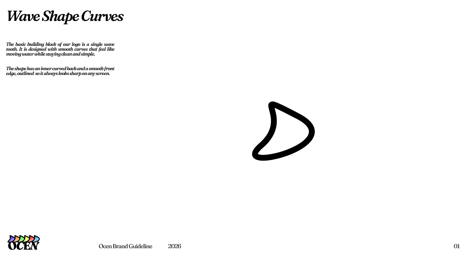
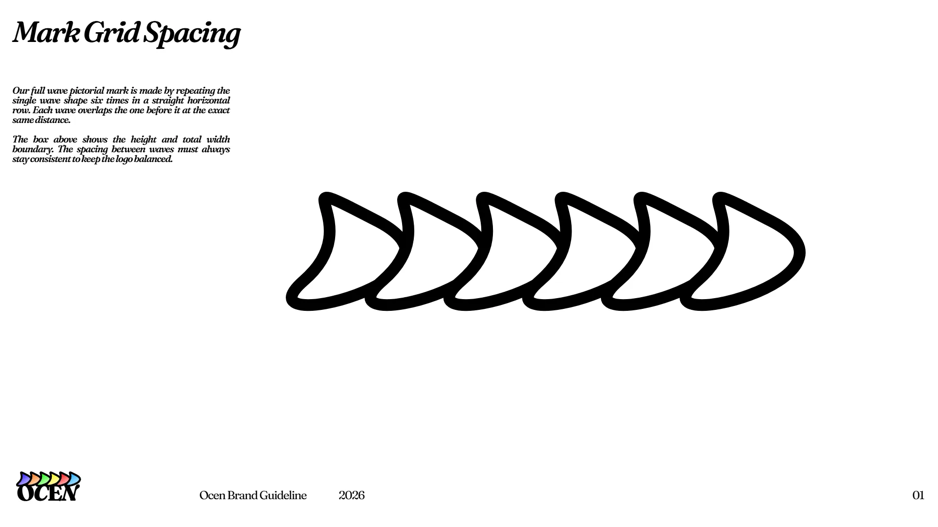
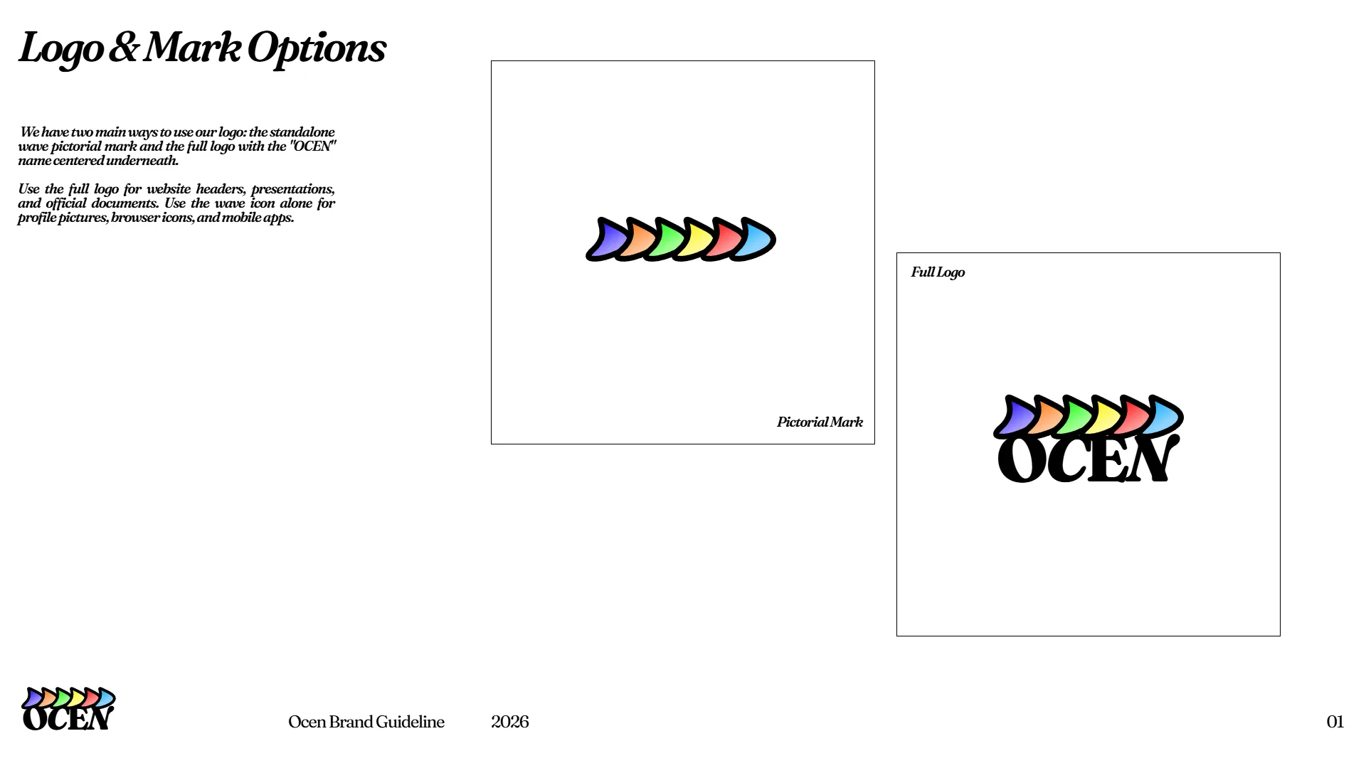
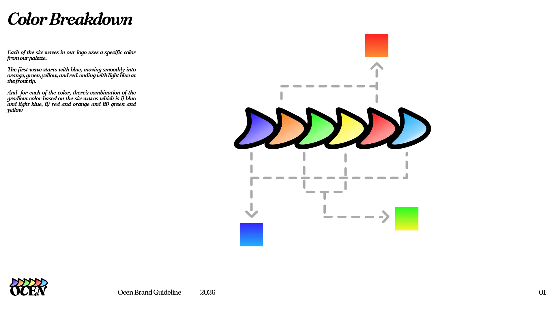
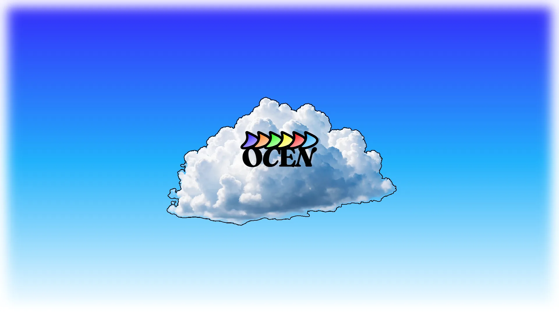
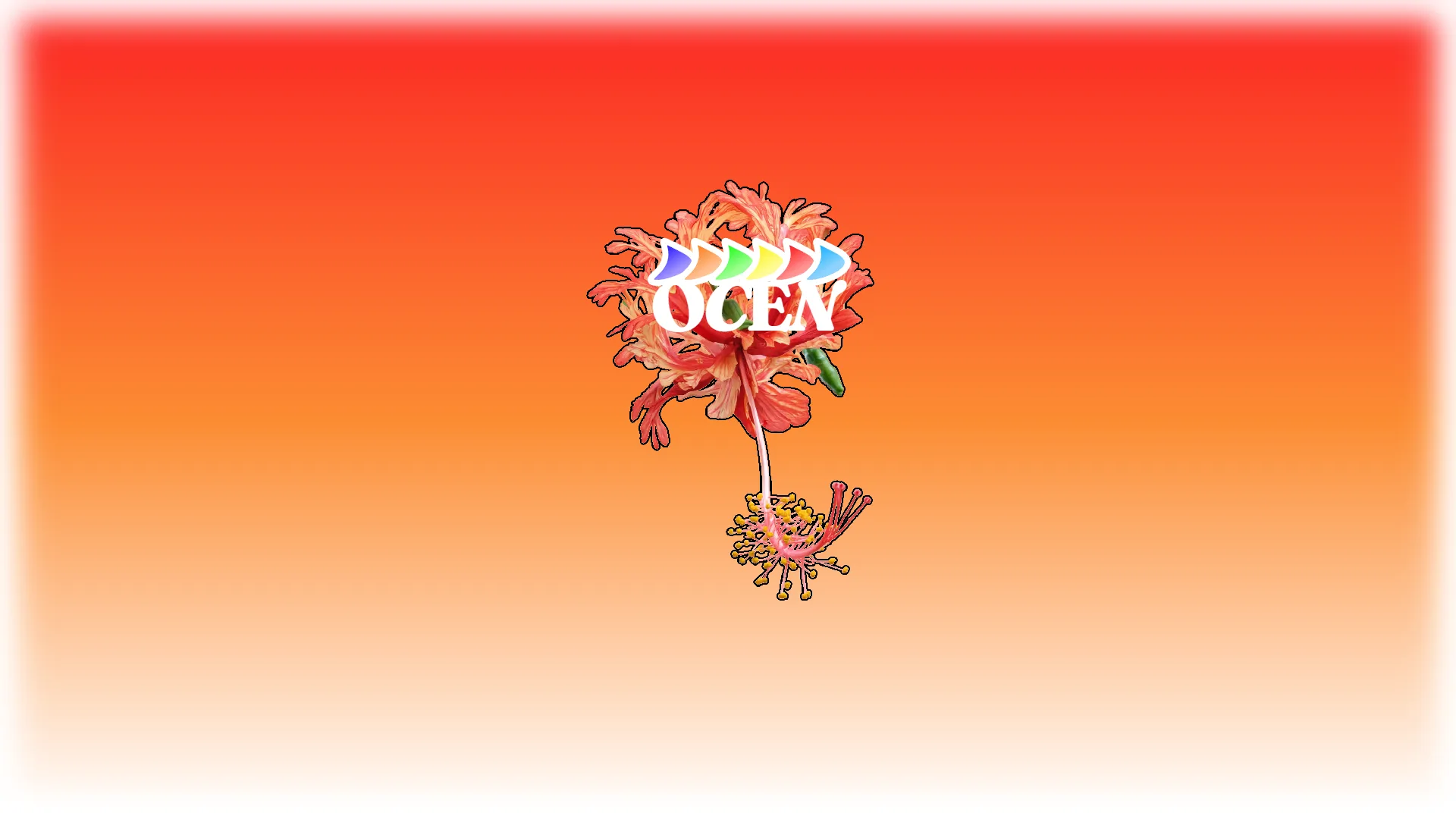
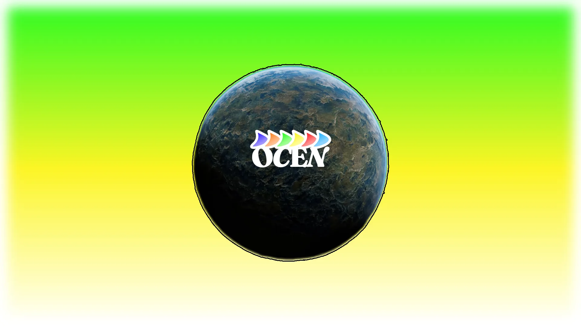
The name OCEN is a play on the word ocean. The wave pictorial mark was born from stretching and curving basic geometry until it took the shape of a smooth ocean wave. To me, this wave represents adaptability, reflecting a design mindset that stays fluid and flexible to meet different client needs. The gradient colors across the mark convey a simple thought, showing that whatever creative direction, style, or solution a client needs, they can find it all under one roof.
Multi-Platform Touchpoints
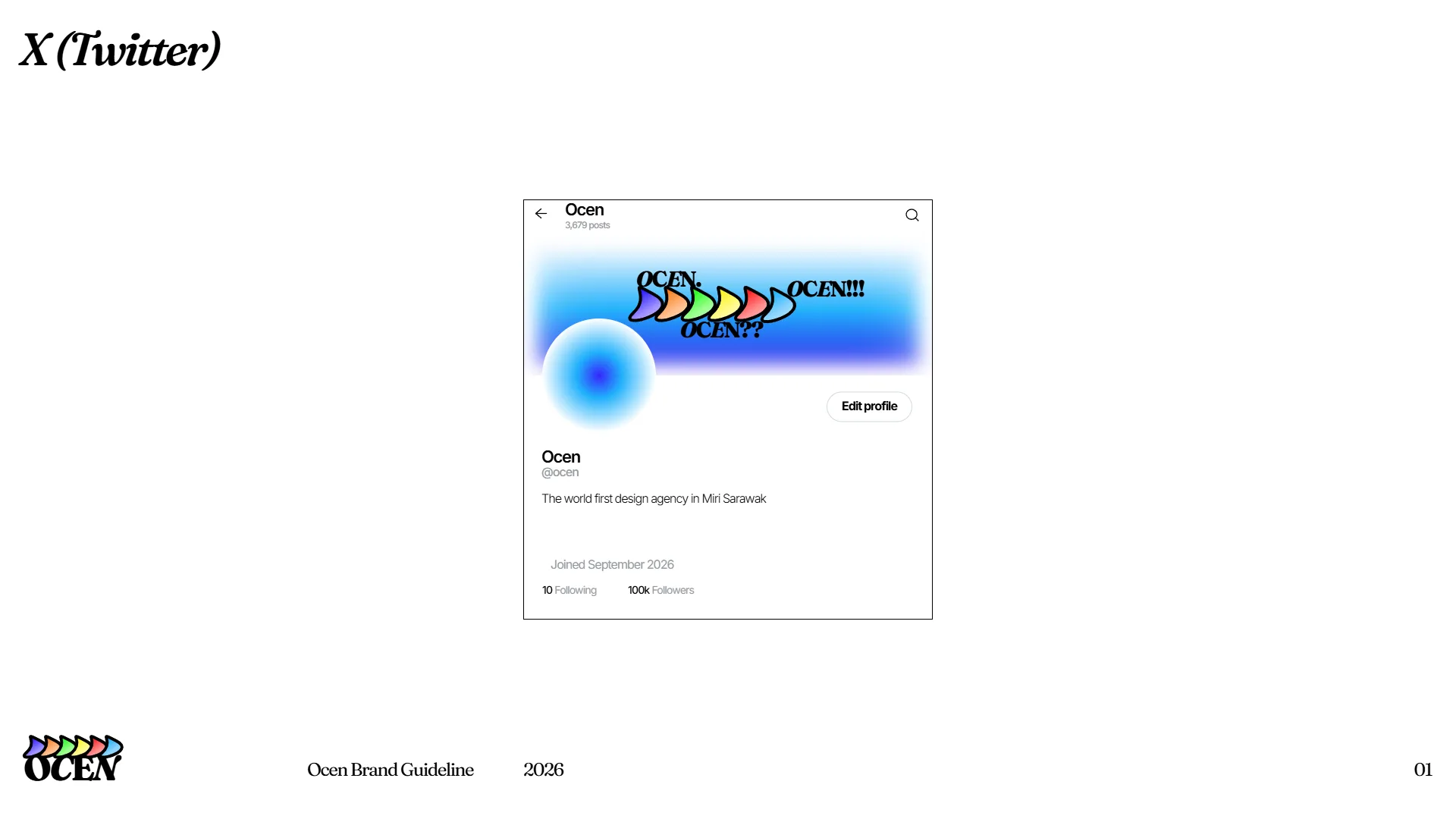
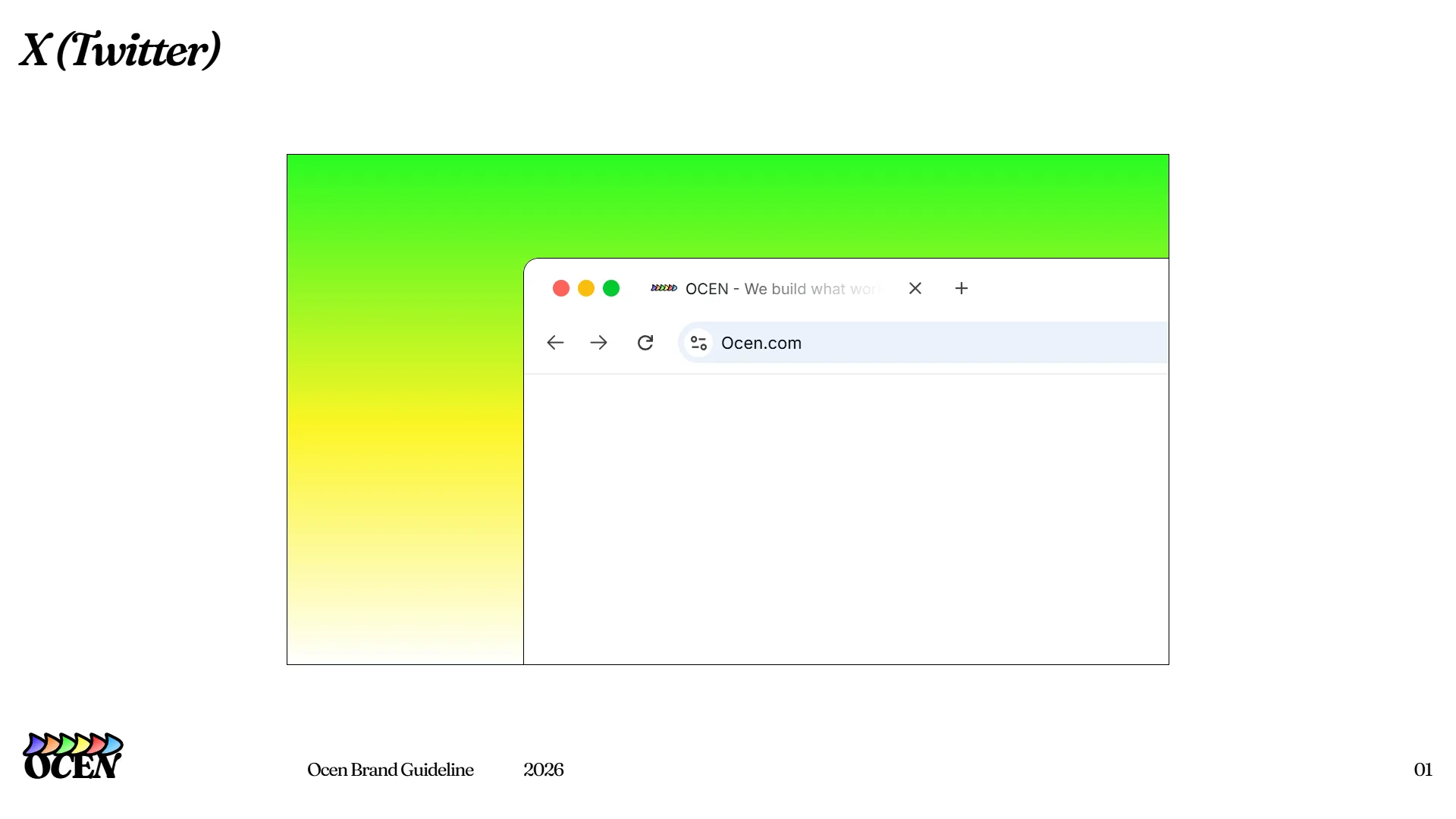
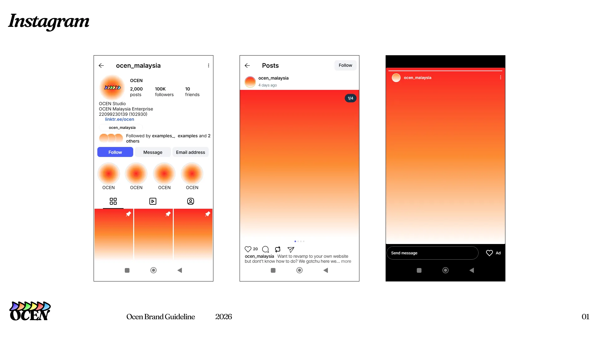
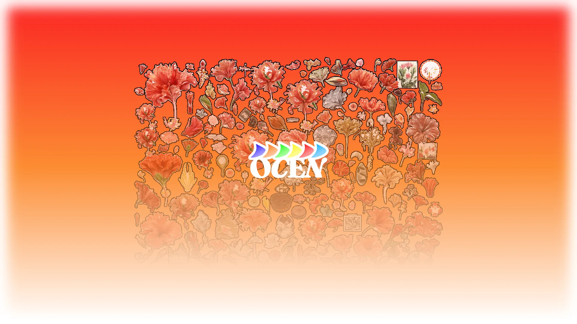
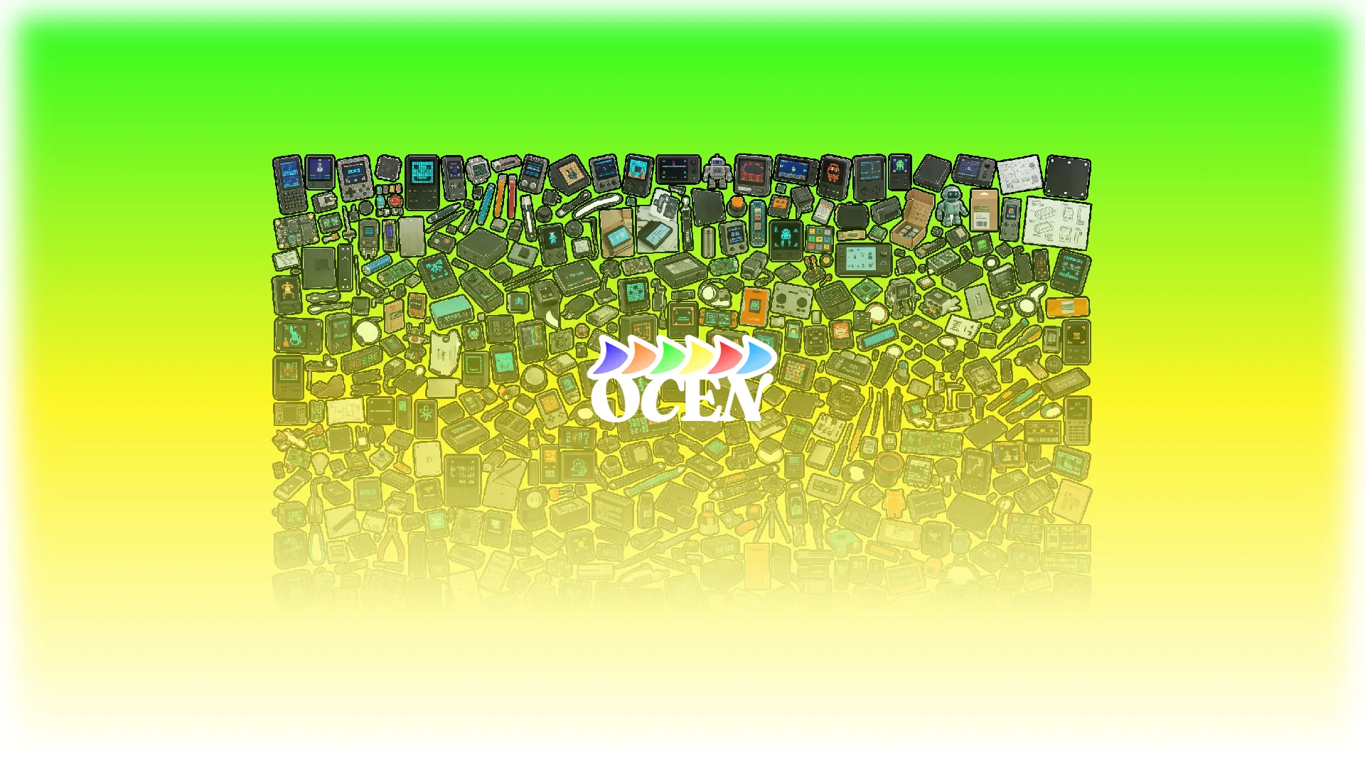
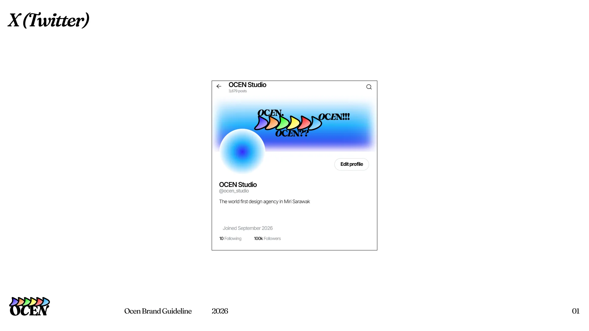
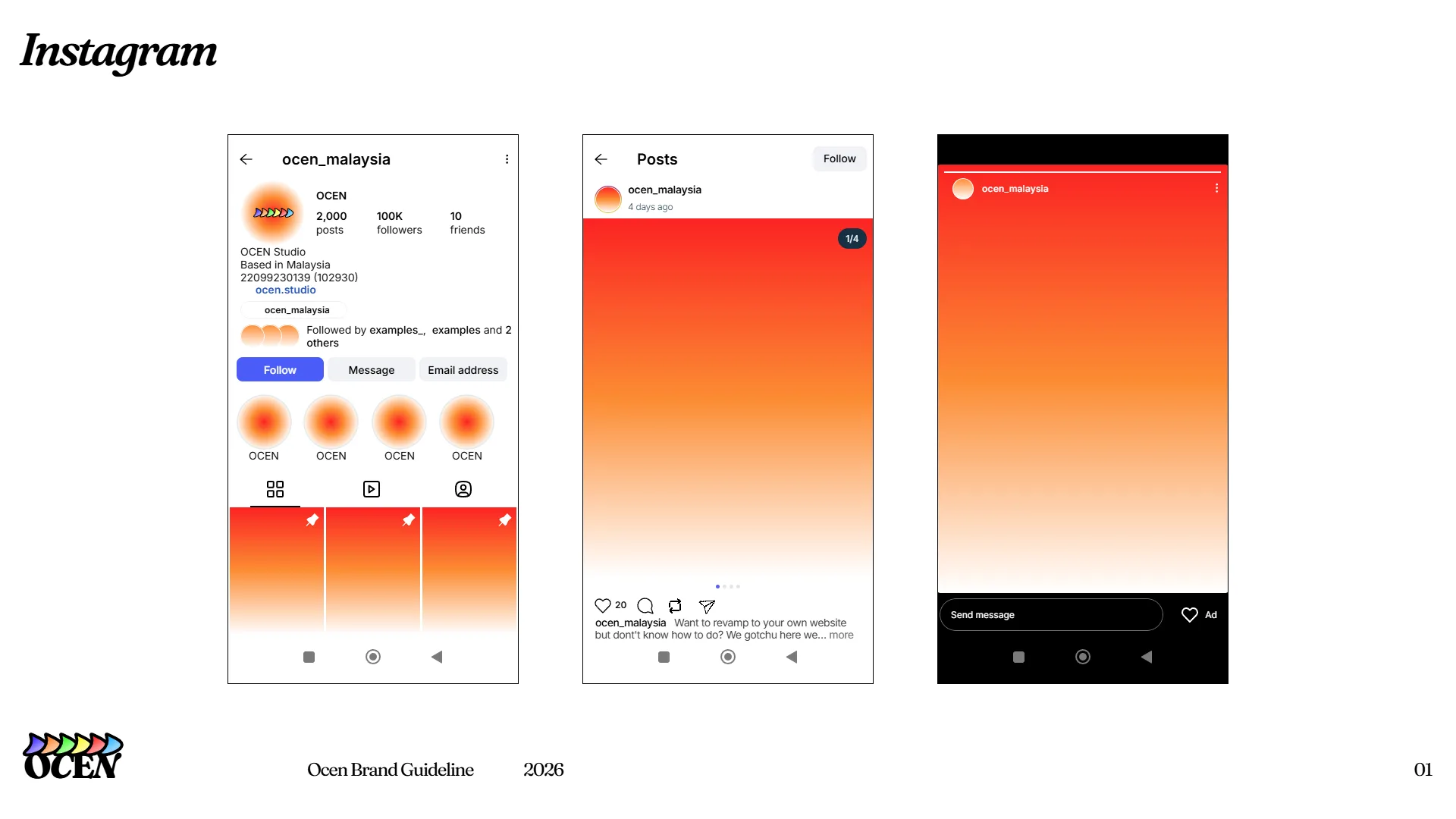
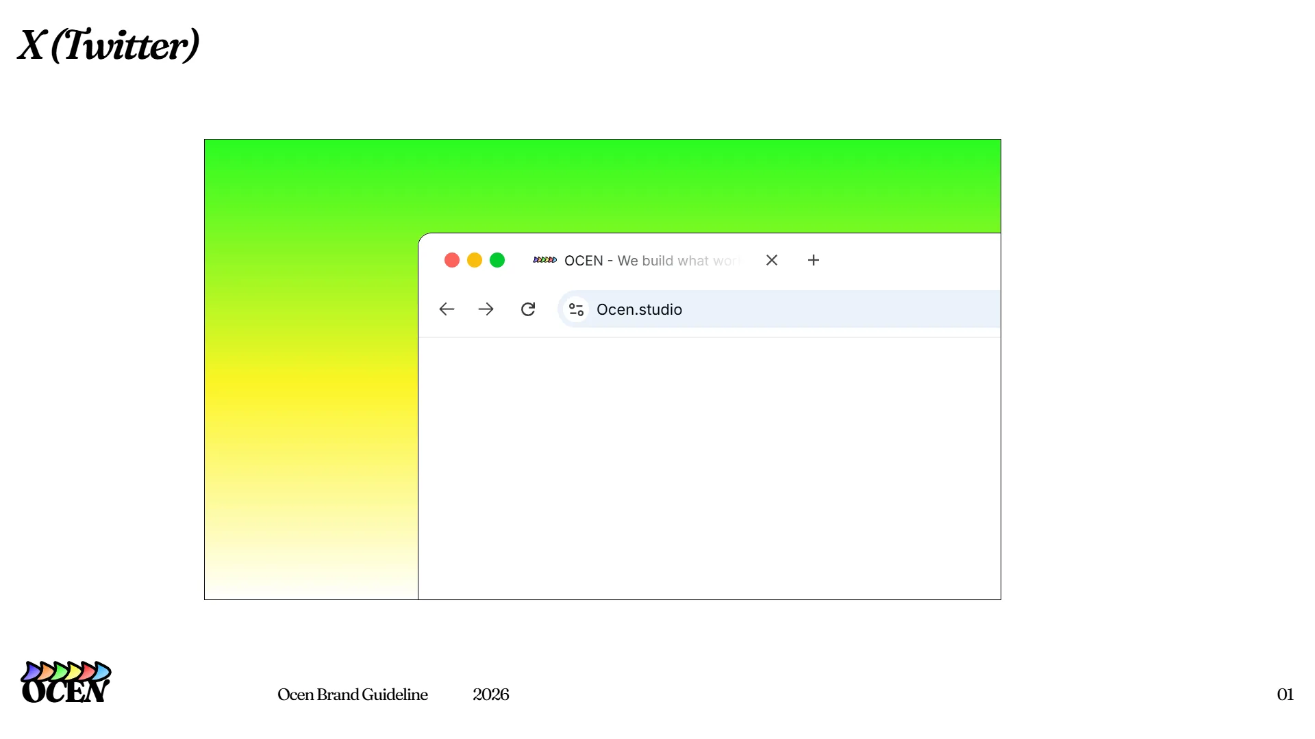
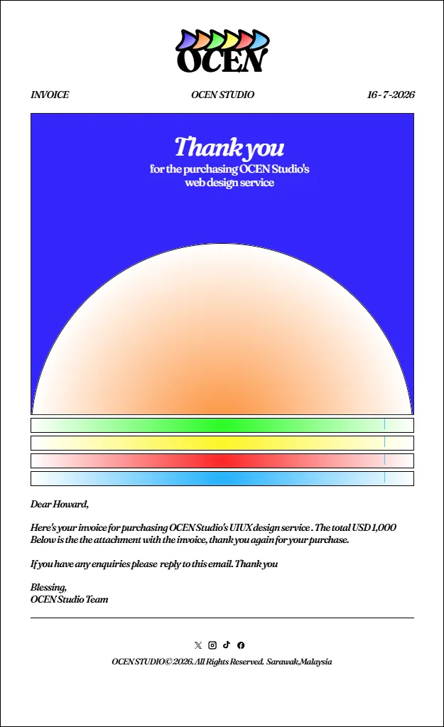
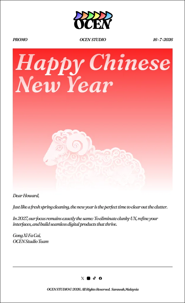
Exploration of Twitter and social header cards, browser window frameworks, and multi-screen Instagram layouts.
Typography and Visual Warmth
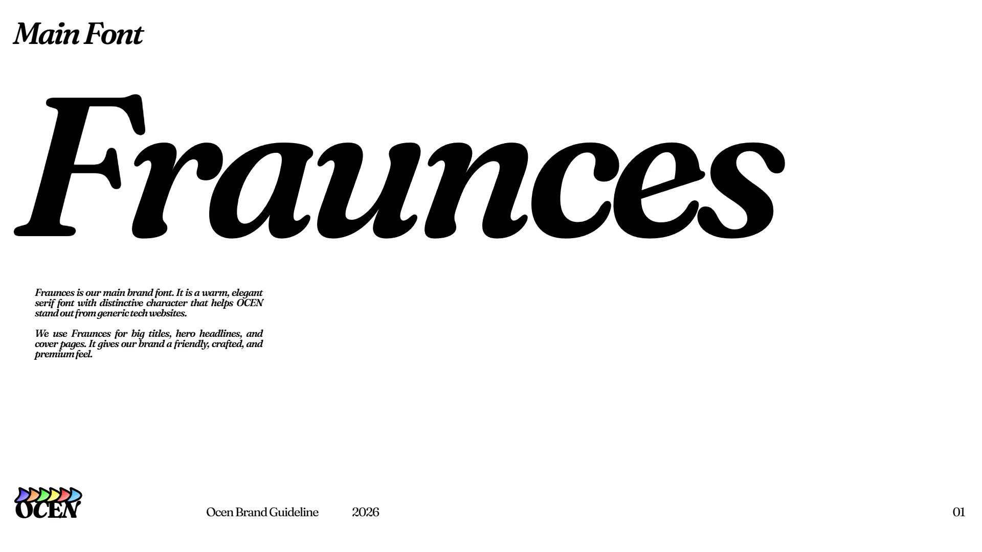
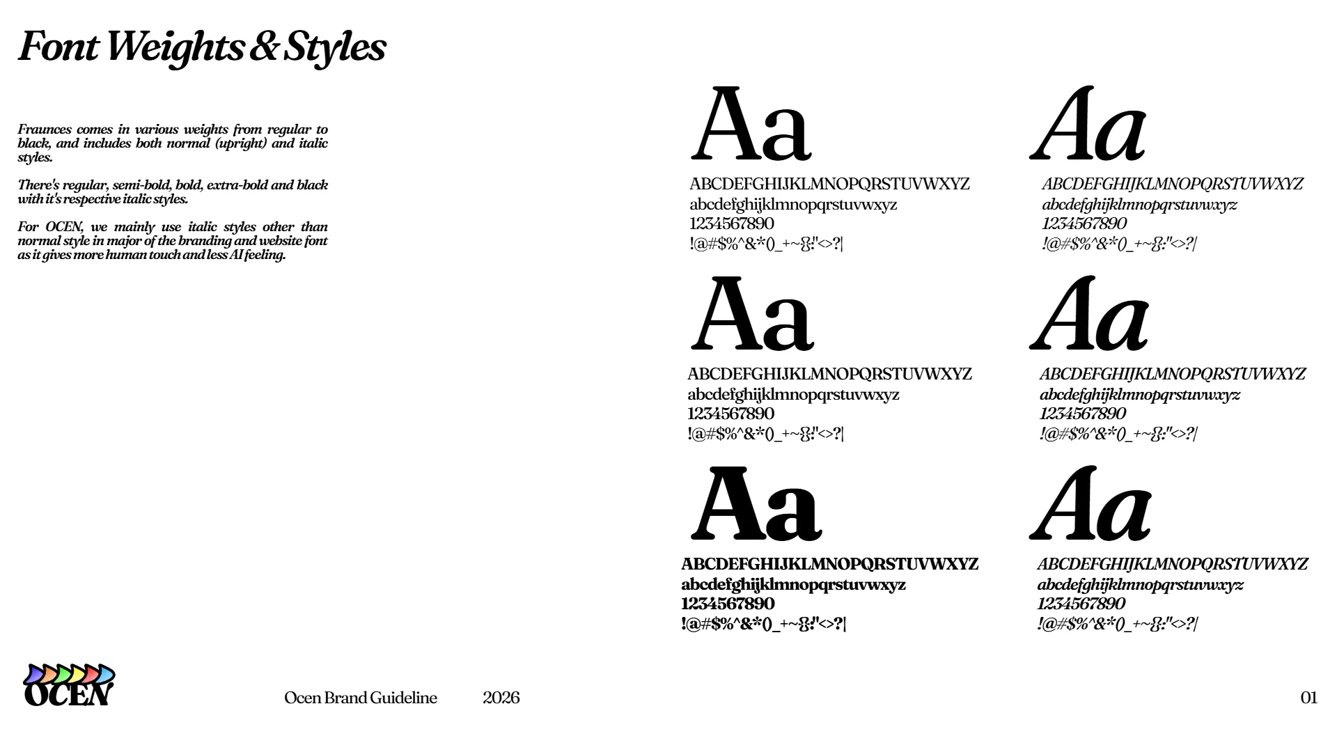
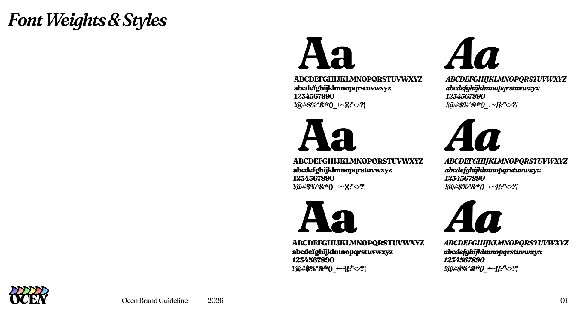
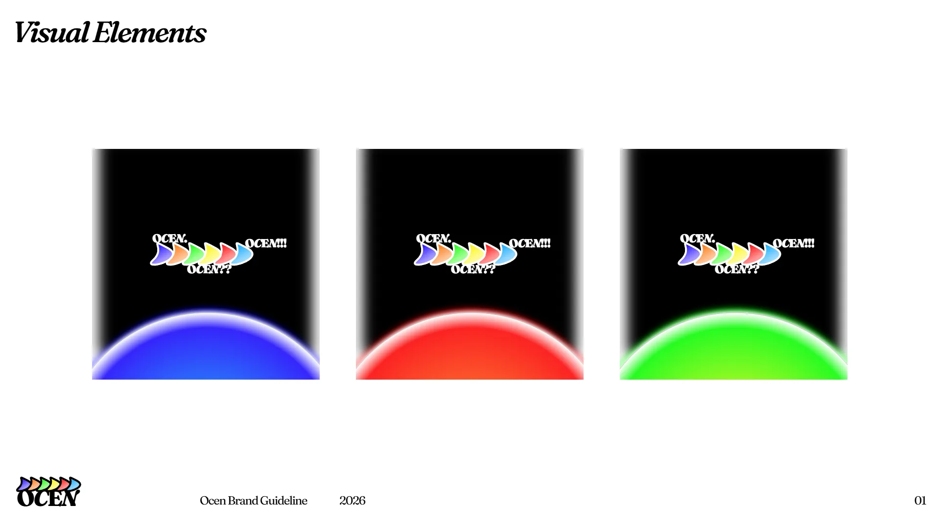
I decided early on to avoid typical sans-serif fonts like Inter because I wanted a serif typeface that brought real warmth and personality to the brand. Fraunces stood out to me because it combines a bold, grounded weight with gentle, organic curves. Those curves mirror the flow of the wave pictorial mark and give every heading a handcrafted feel. On top of the typography, I added gentle white inner shadows to the visual containers. This creates a soft, hazy depth that makes the digital cards feel tangible instead of flat.
Multi-Platform System and Modern Workflow
I designed this identity system to scale across all the touchpoints where the agency will live, including the future website, Instagram, Twitter, LinkedIn, TikTok, and Xiaohongshu. My workflow combined design and code together. I structured the layouts and components in Framer, explored visual concepts with Gemini Flash, and used the Antigravity CLI to write custom code effects that generated clean, high-resolution static graphics.
Brand Guidelines Manual
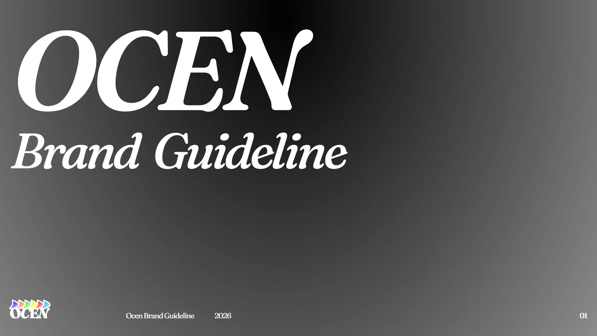
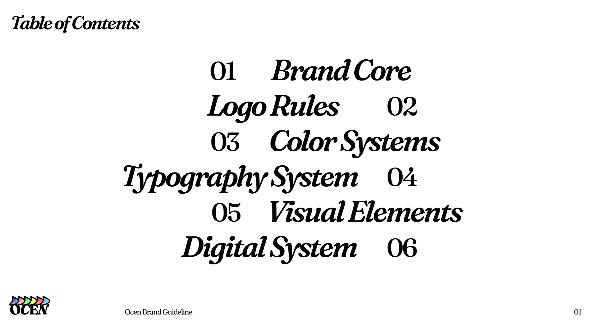
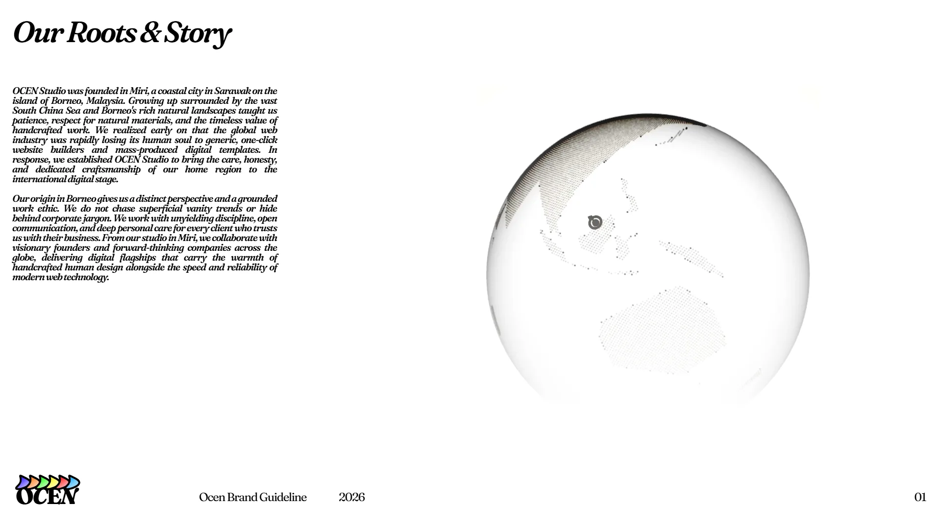
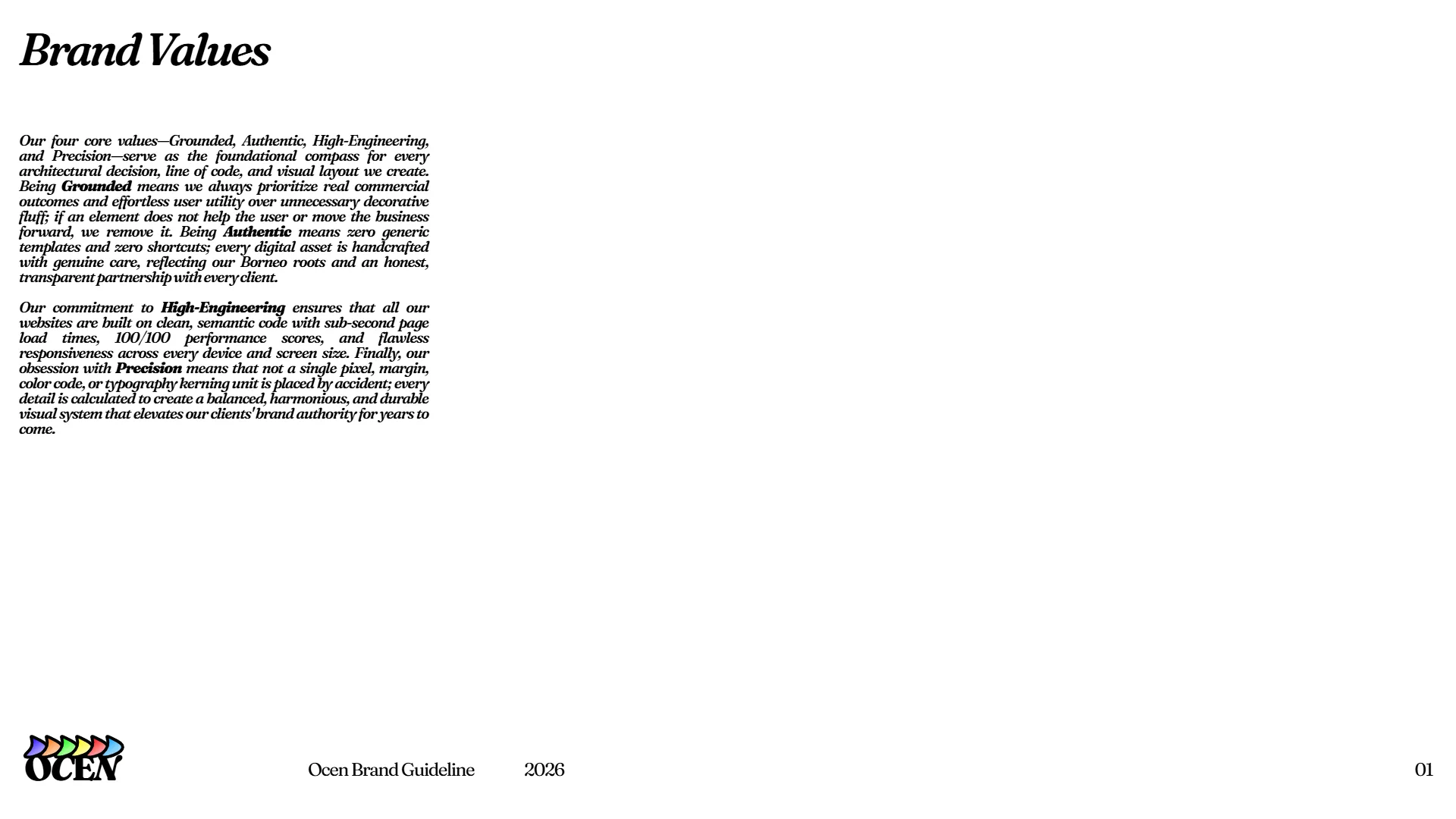
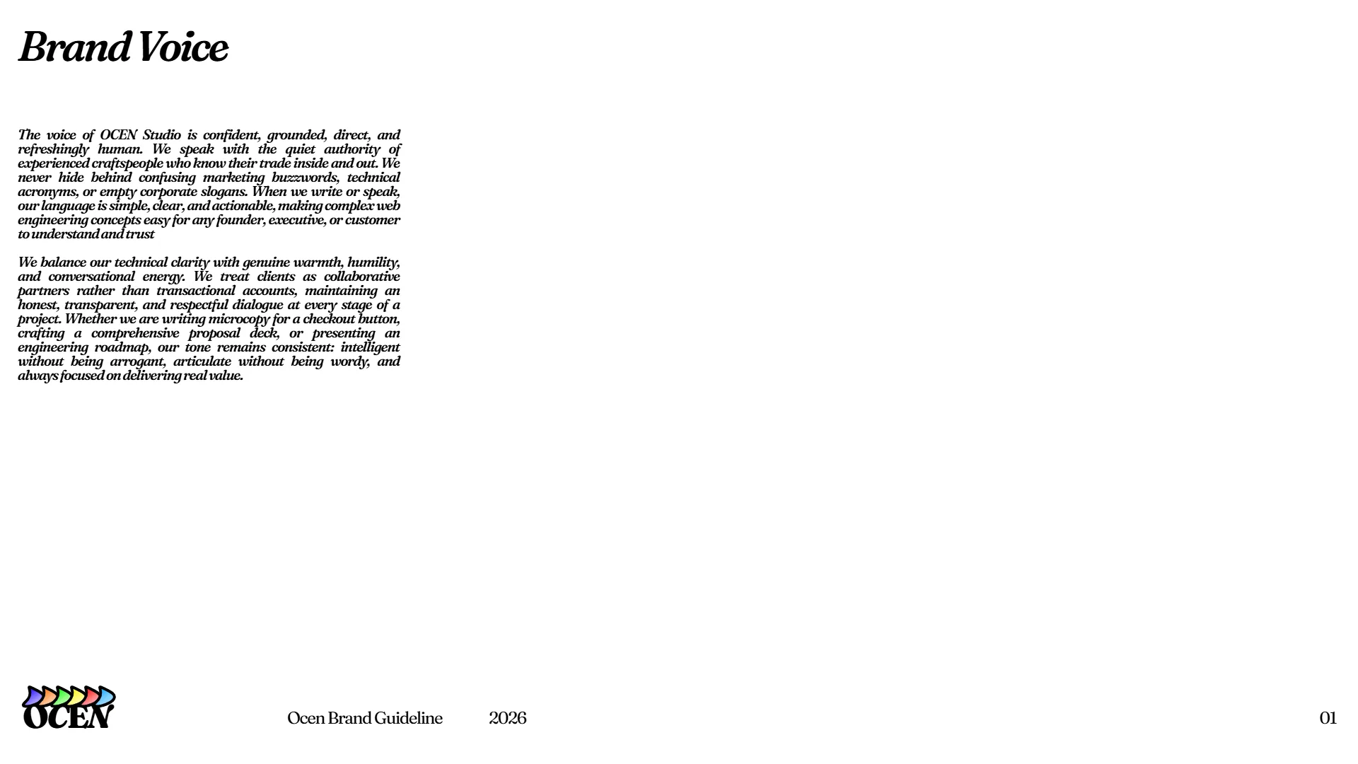
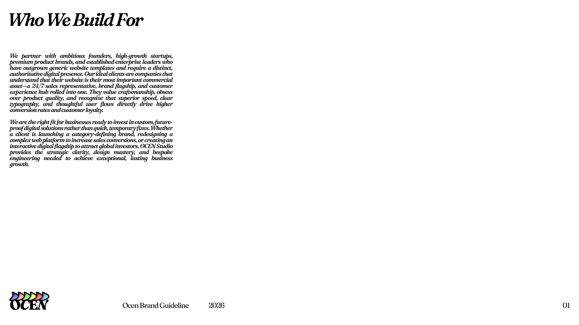
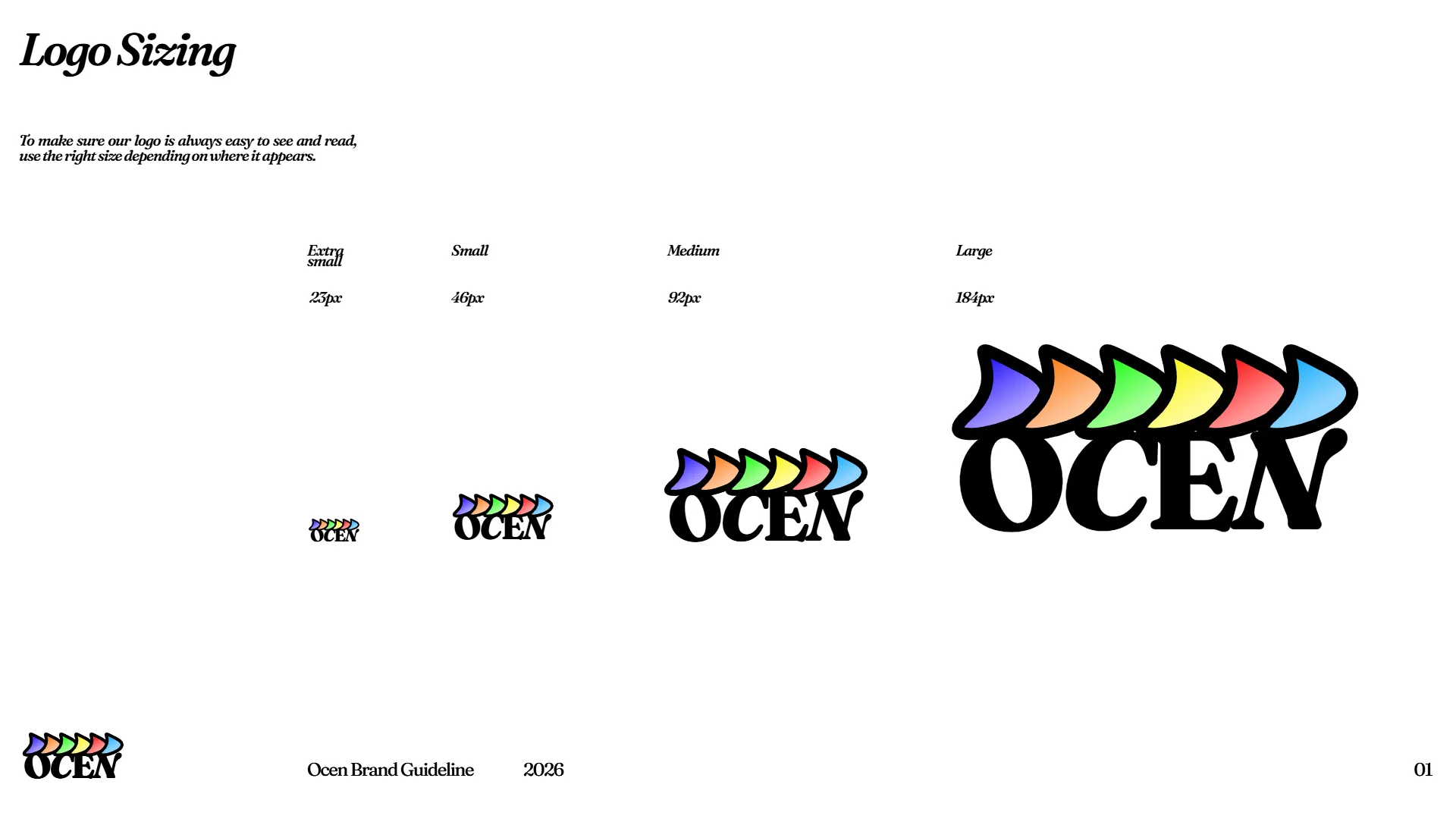
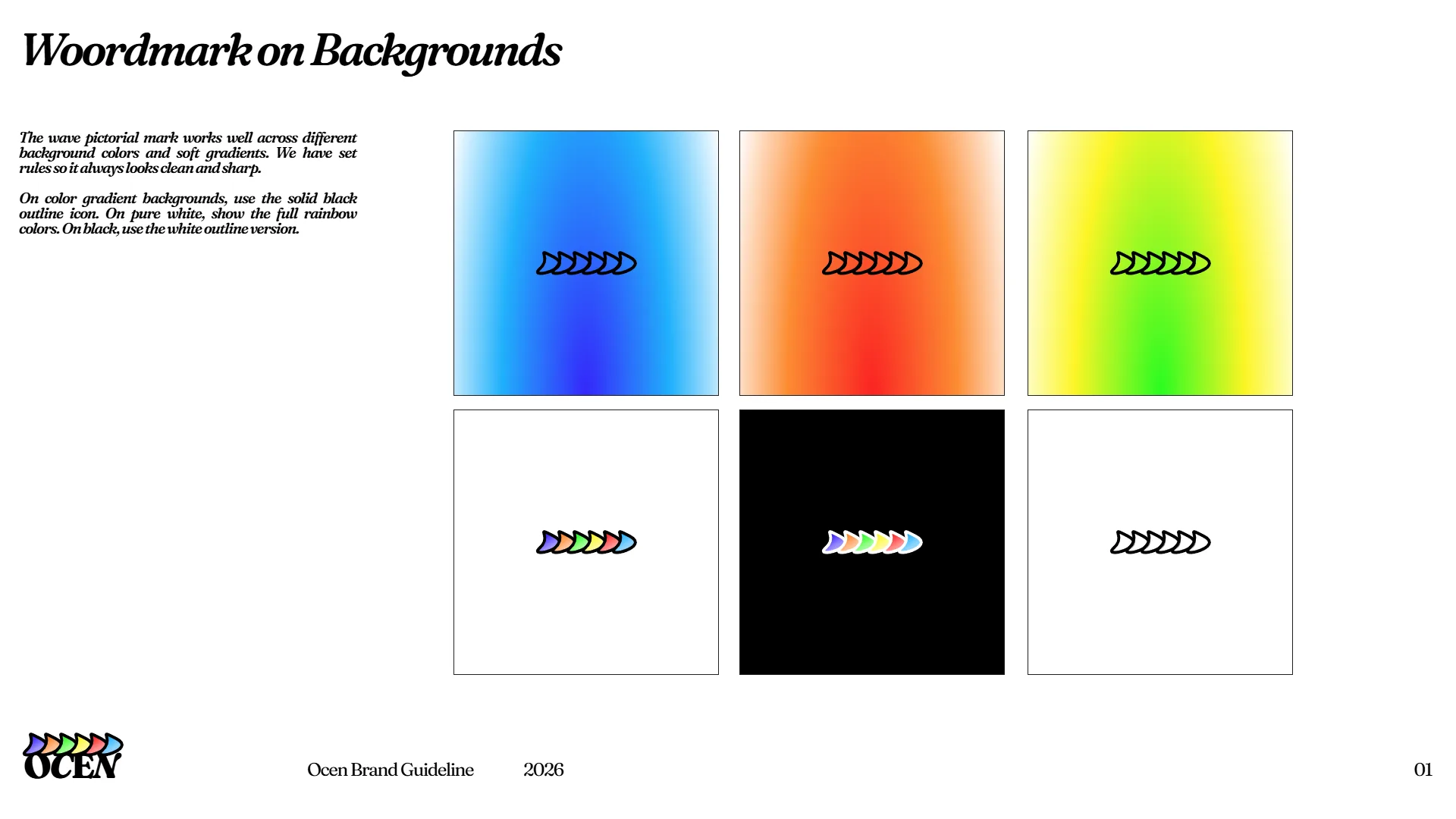
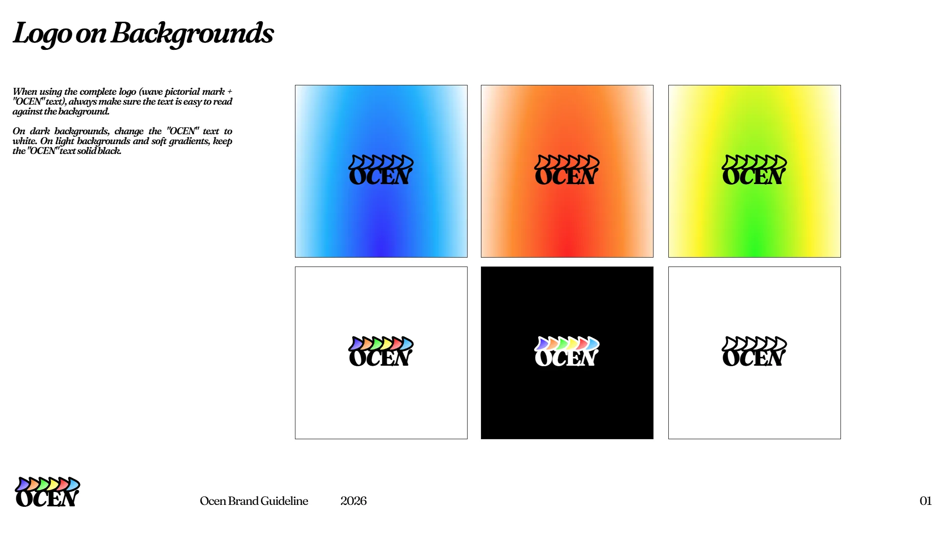
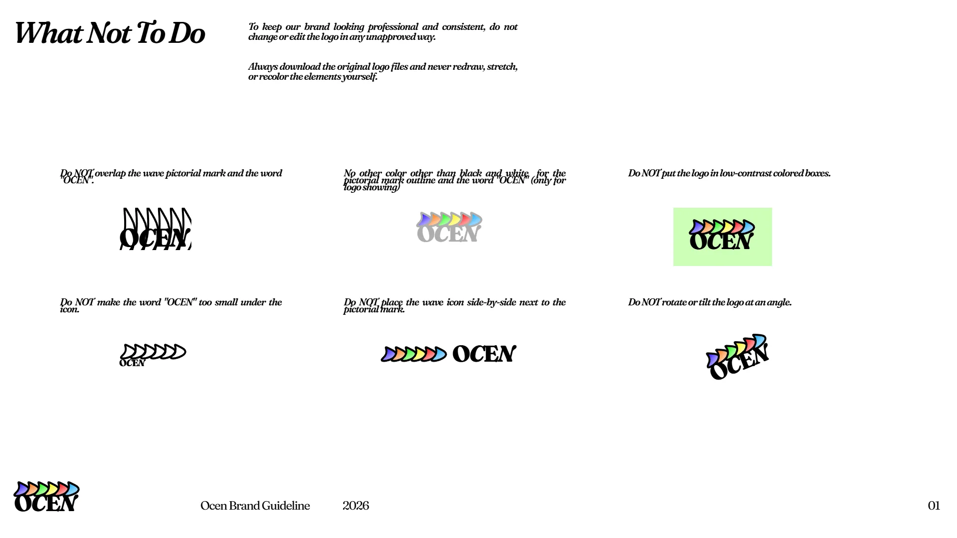
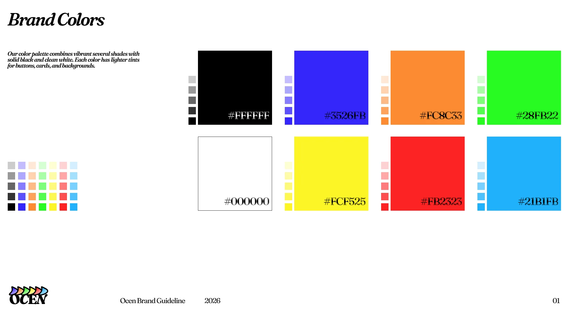
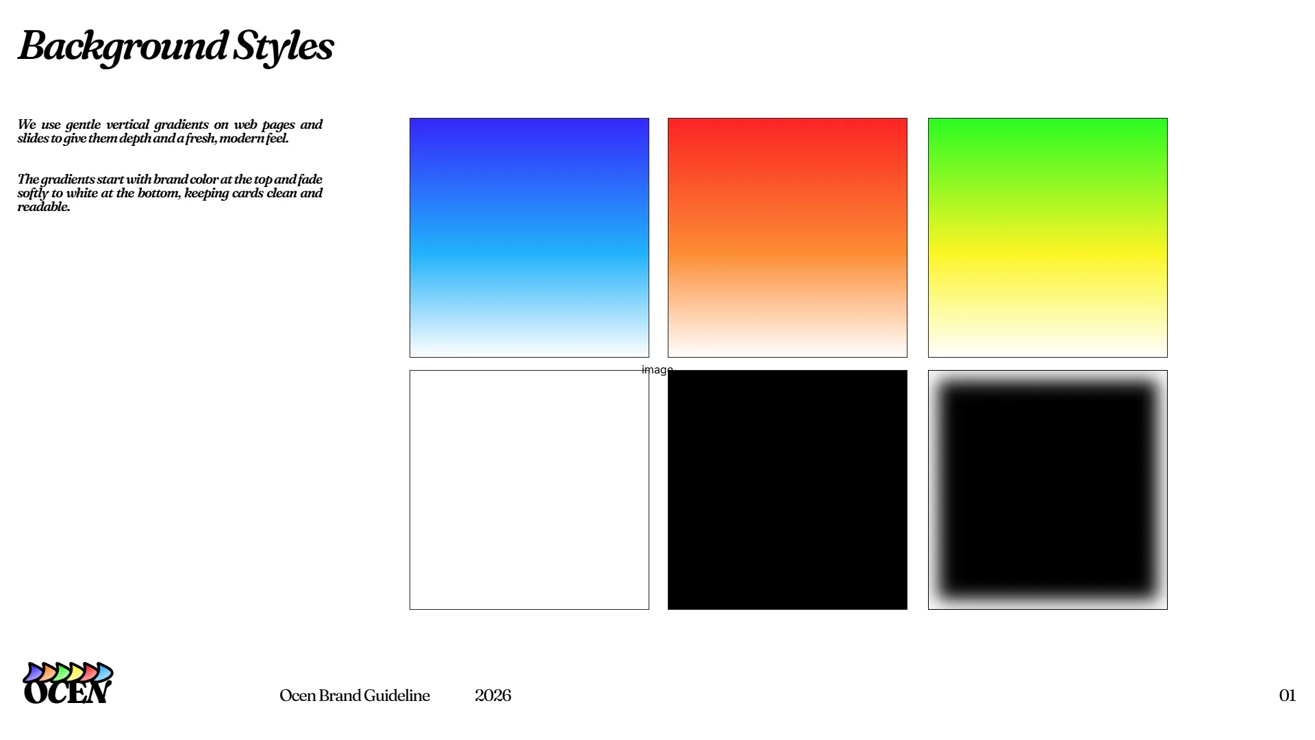
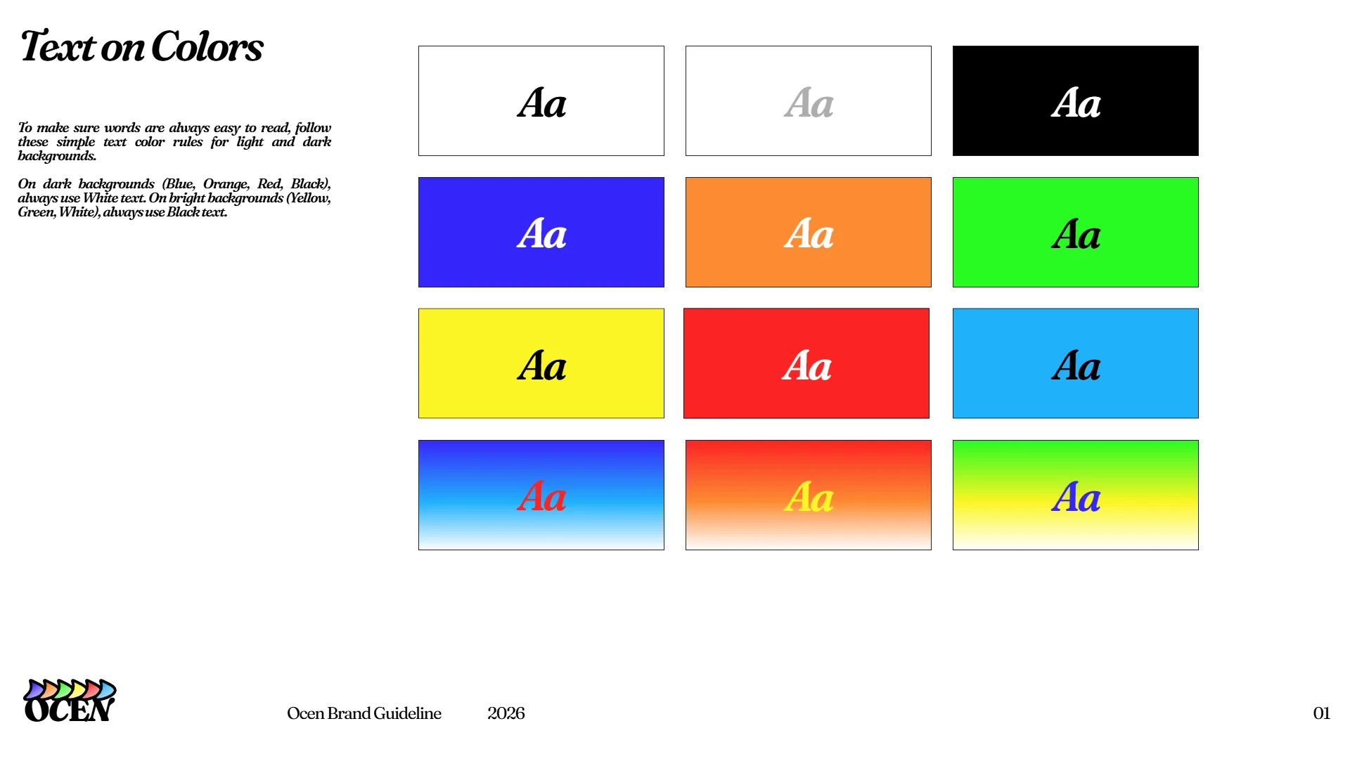
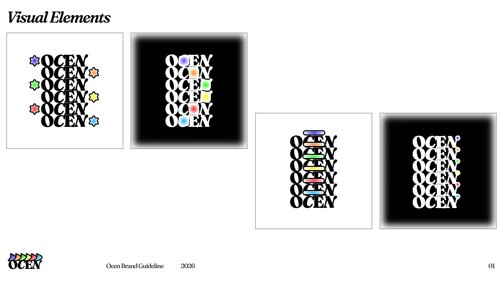
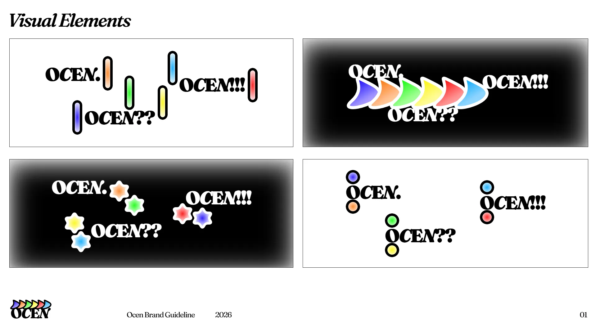
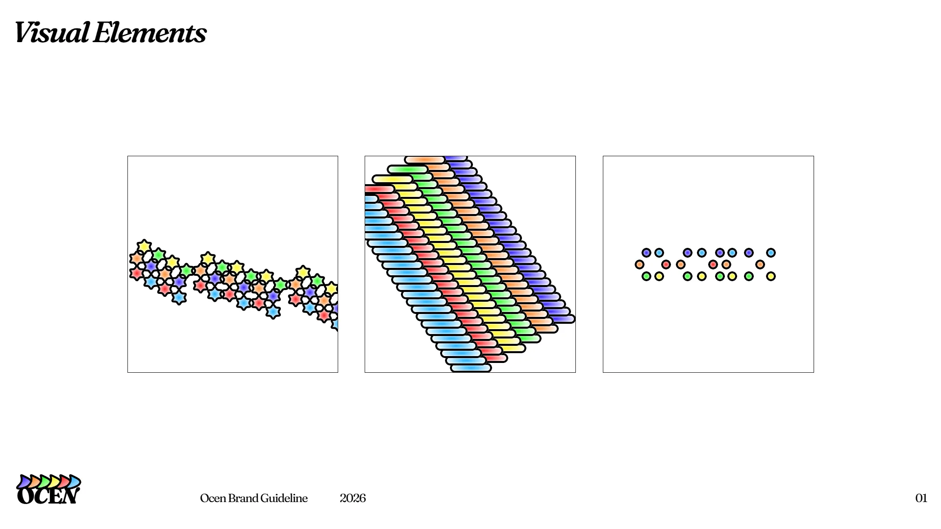
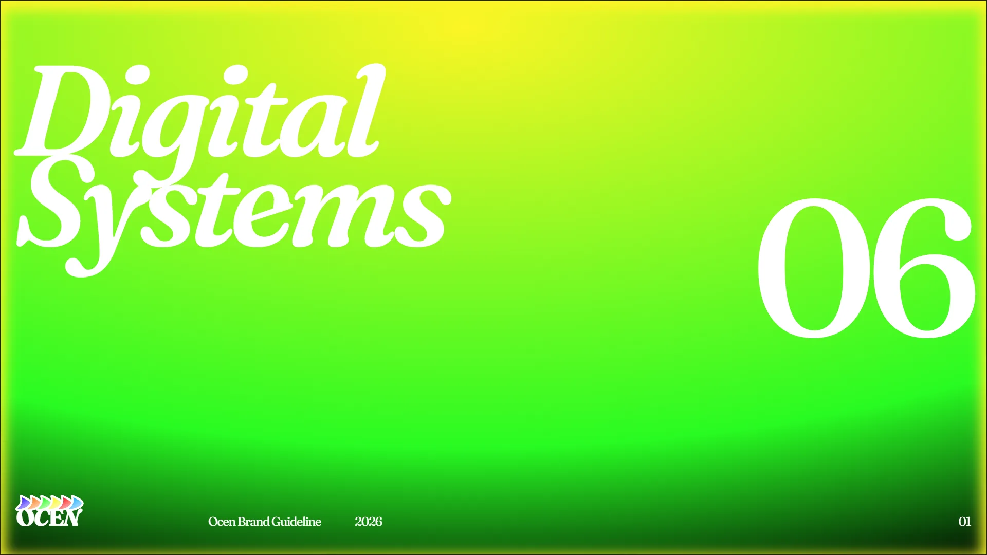
A deep dive into the complete brand guideline sheets, covering typography hierarchy, color codes, grid systems, logo construction, and digital asset templates. Click any sheet to open the high-resolution lightbox view.

Results and What Comes Next
This project helped me turn an open idea into a fully documented brand guideline system. It gave me the blueprint for typography, color hierarchies, and social assets that I can use when I officially launch the studio. My next step will be taking these guidelines and designing the live, interactive OCEN website.